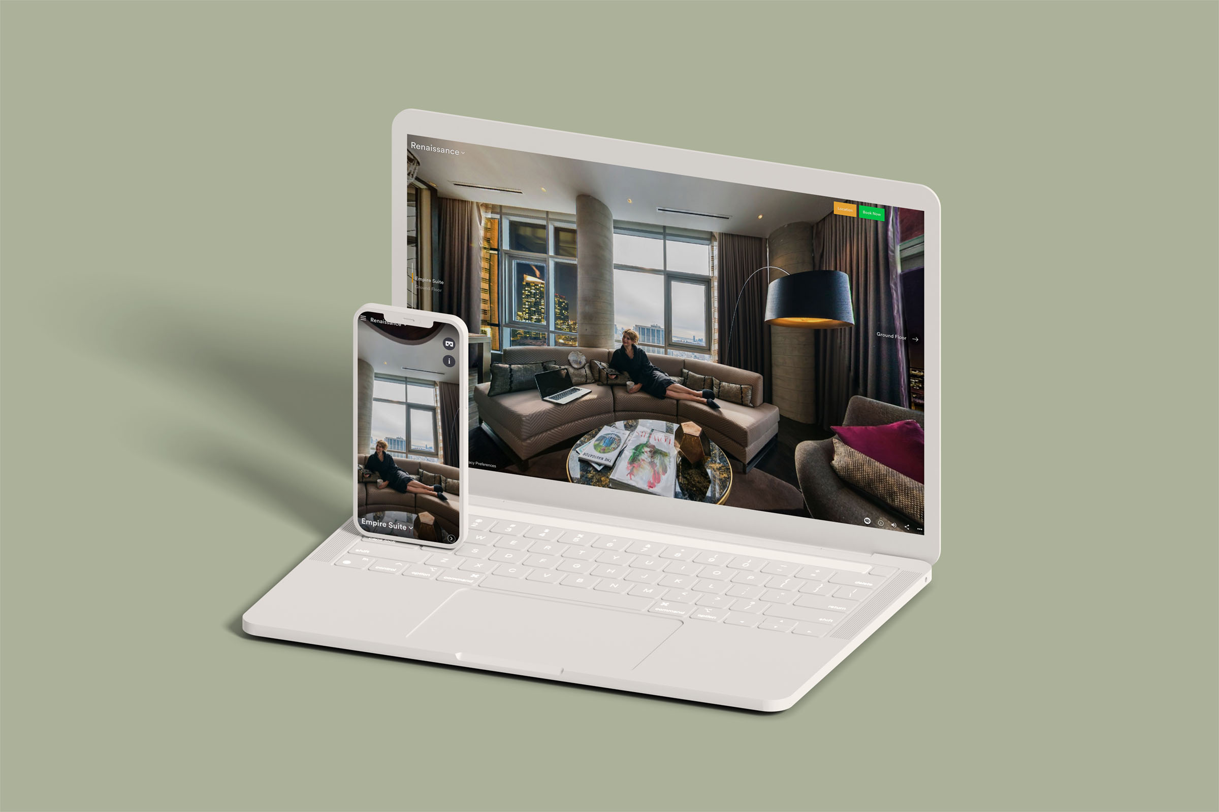
Redesigned the virtual tour experience to further user engagement and drive emotion
Business impact: Average time spent +2.5 minutes. Hotspot click rate increased by 30%.
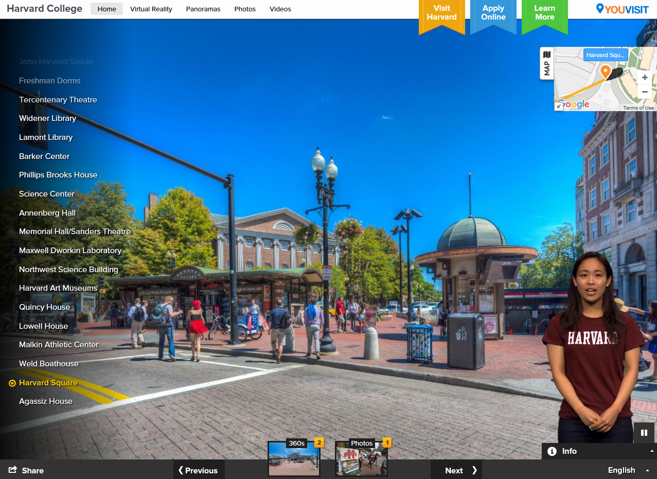
Before the redesign
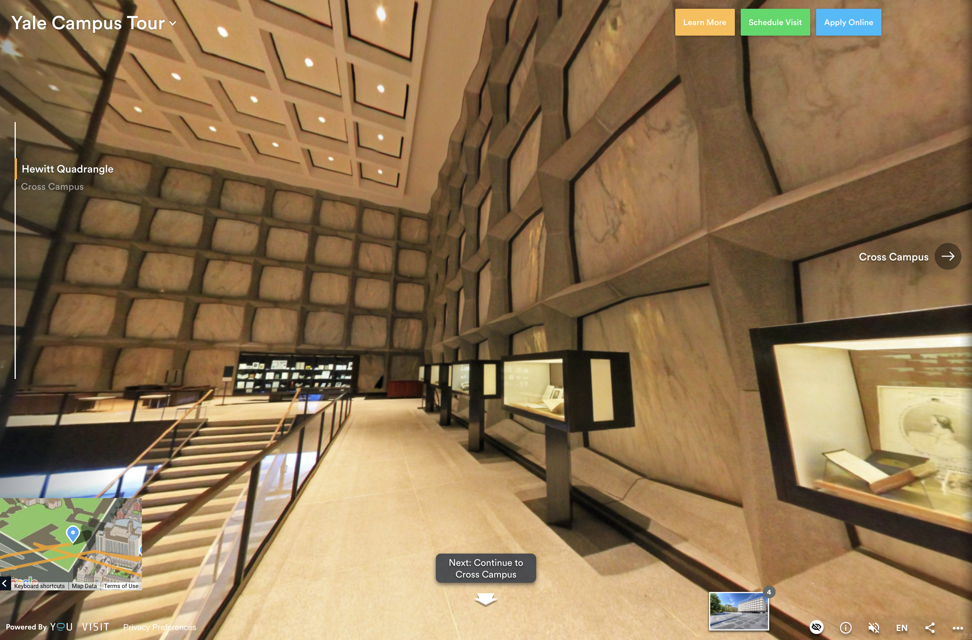
After the redesign
Background
YouVisit hadn't had major improvements in virtual tours for several years. It started to hurt our sales and client retention rate, given our clients are on a subscription model that renews every year.
The original UI had a strong presence and took the user's focus away from the content. It breaks the immersion and misses the opportunity to elicit stronger emotions, which is critical in turning visitors into interested prospects.
>
Problems with the original UI
List of scenes in the tour is always present and covers a significant part of the content.
Different tabs in top bar are rarely used. CTAs don't look like buttons.
No specific logic in positioning UI elements.
Rethink the UI
Our main goal was to reduce visual noise, and create a mental model by grouping related features together
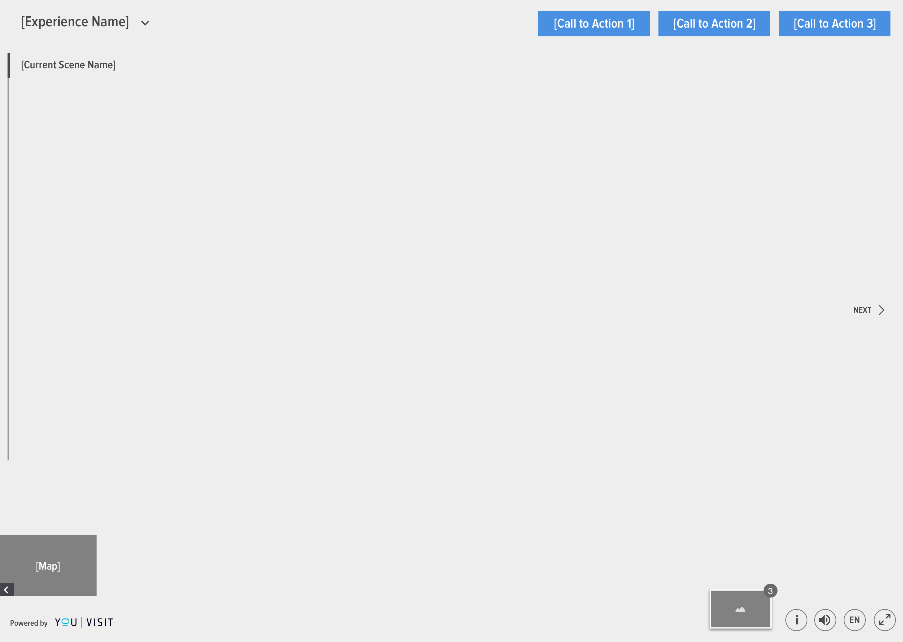
Initial concept wireframe
Navigational features are moved to the left. Reduced the scene list to only show the current scene.
Top bar is cleaned up to bring more attention to the CTAs.
Tour preferences like language, audio, more info (text, photos, videos) are on the bottom right, less prominent.

Redesigned Virtual Tour UI
Drive Engagement
With UI noise reduced and better grouping of elements, we wanted to further motivate user to interact with the content.
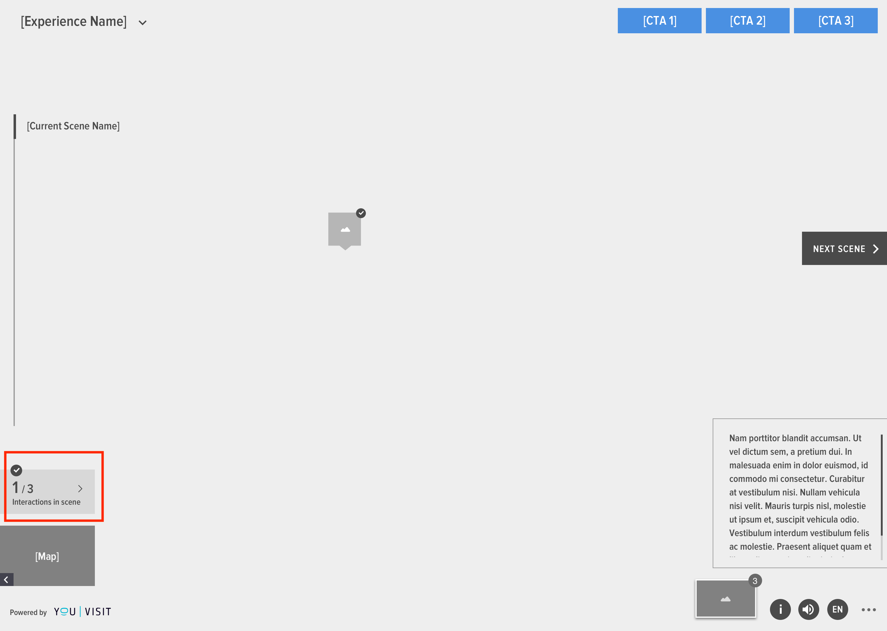
Interactive Elements Count
In the panorama, the user can explore different elements in the scene, but the ones are "behind the user" are often overlooked.
We implemented a way to call out the # of interactive elements in the scene to be or have been viewed, to gamify the experience.
+30%
users interacted with all elements
Results
+2.5 Minutes
Avg. time on site
+30%
Hotspot click rate
