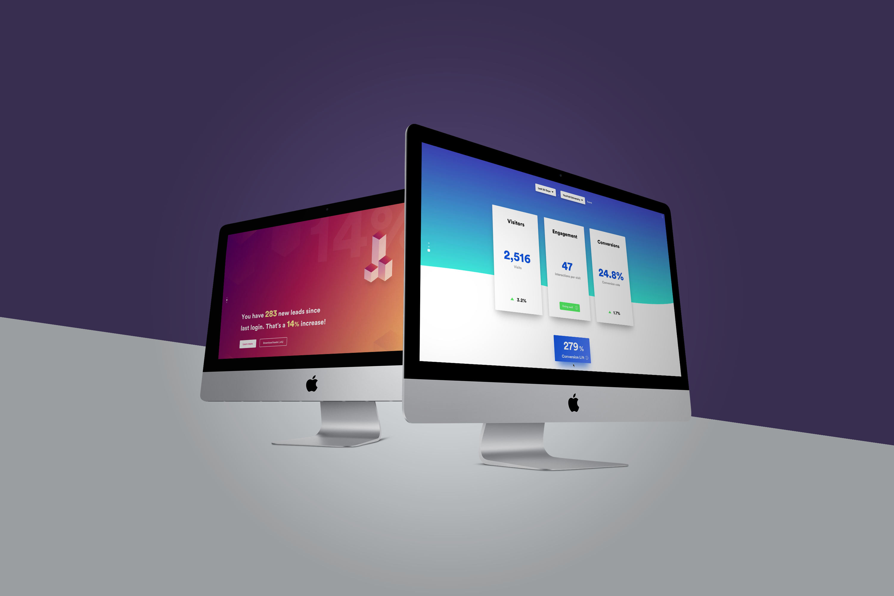
Final Design
Background
The dated interface and siloed data didn’t make a compelling story to demonstrate ROI of virtual tours.
YouVisit was facing increasing cancellation of contract, and wanted to revamp the analytics platform to increase utilization and highlight the value YouVisit virtual tours bring.
>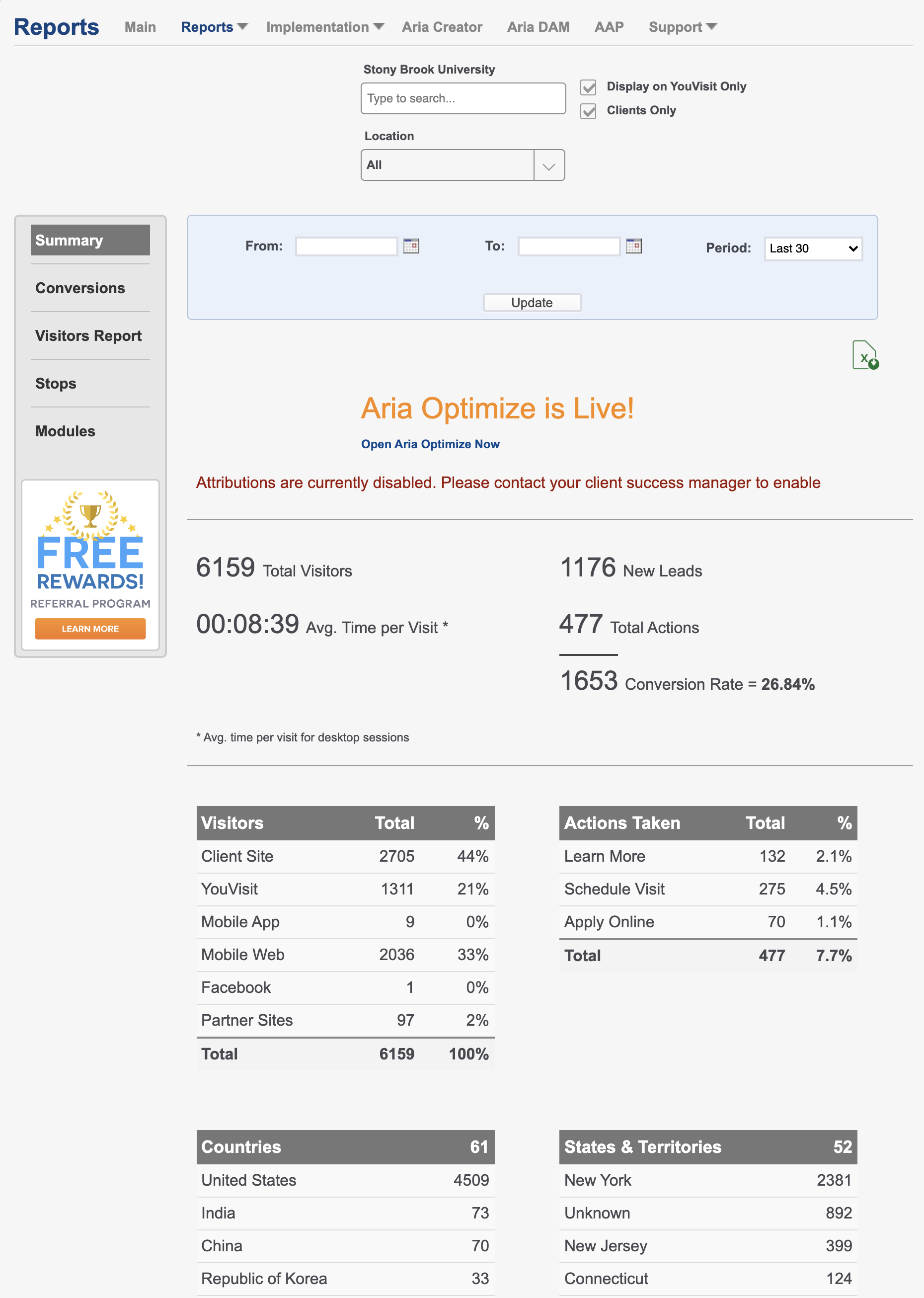
Before the redesign
The need for innovation
Many of our clients are not data savvy. They're often overwhelmed by looking at other analytics products like Google Analytics. A new approach was needed to engage them and flip the conception that analytics products are “complex” and “scary”.
>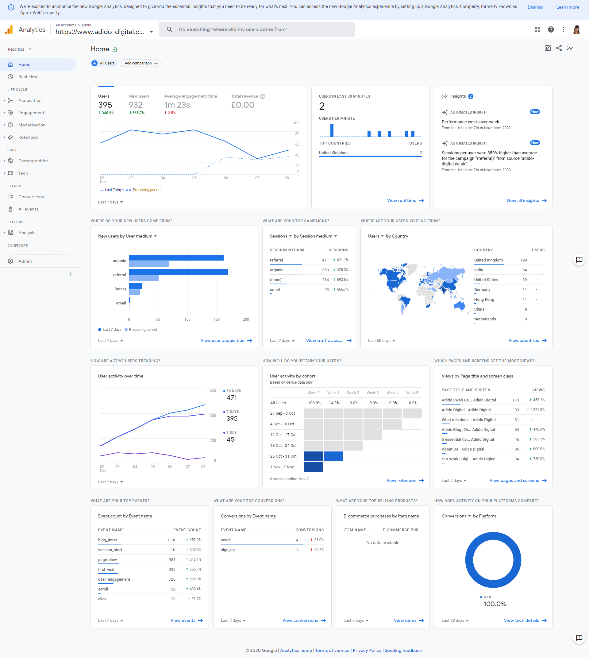
Many clients have Google Analytics but often feel lost
Our Approach
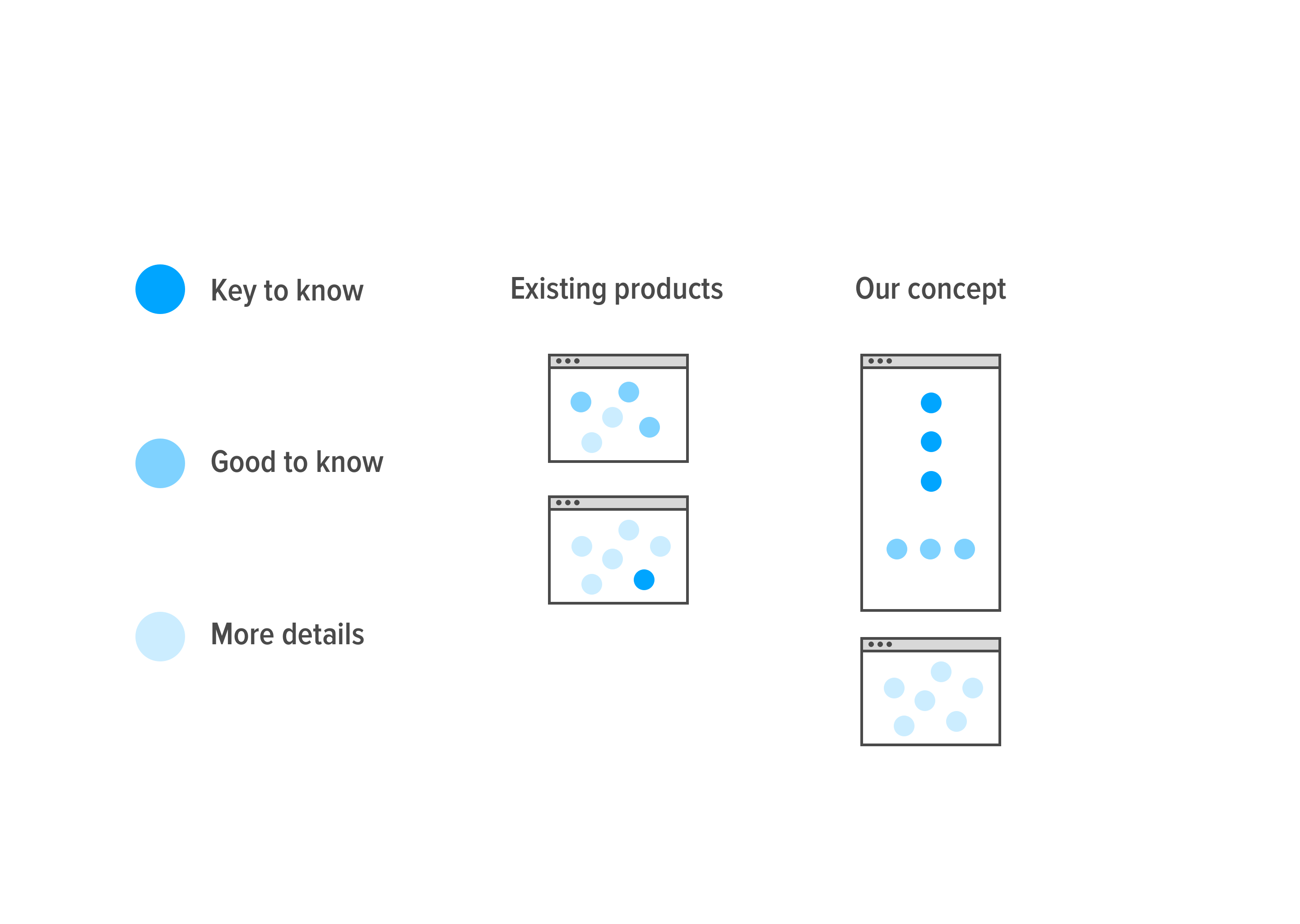
Many analytics products on the market blend different levels of details on the page, which makes it challenging to parse out what is important. Often times, actionable insights are buried deep or require significant time spent in the tool to generate.
Our goal was to surface the most important insights to users as soon as possible, while having easy access to more details
The Design
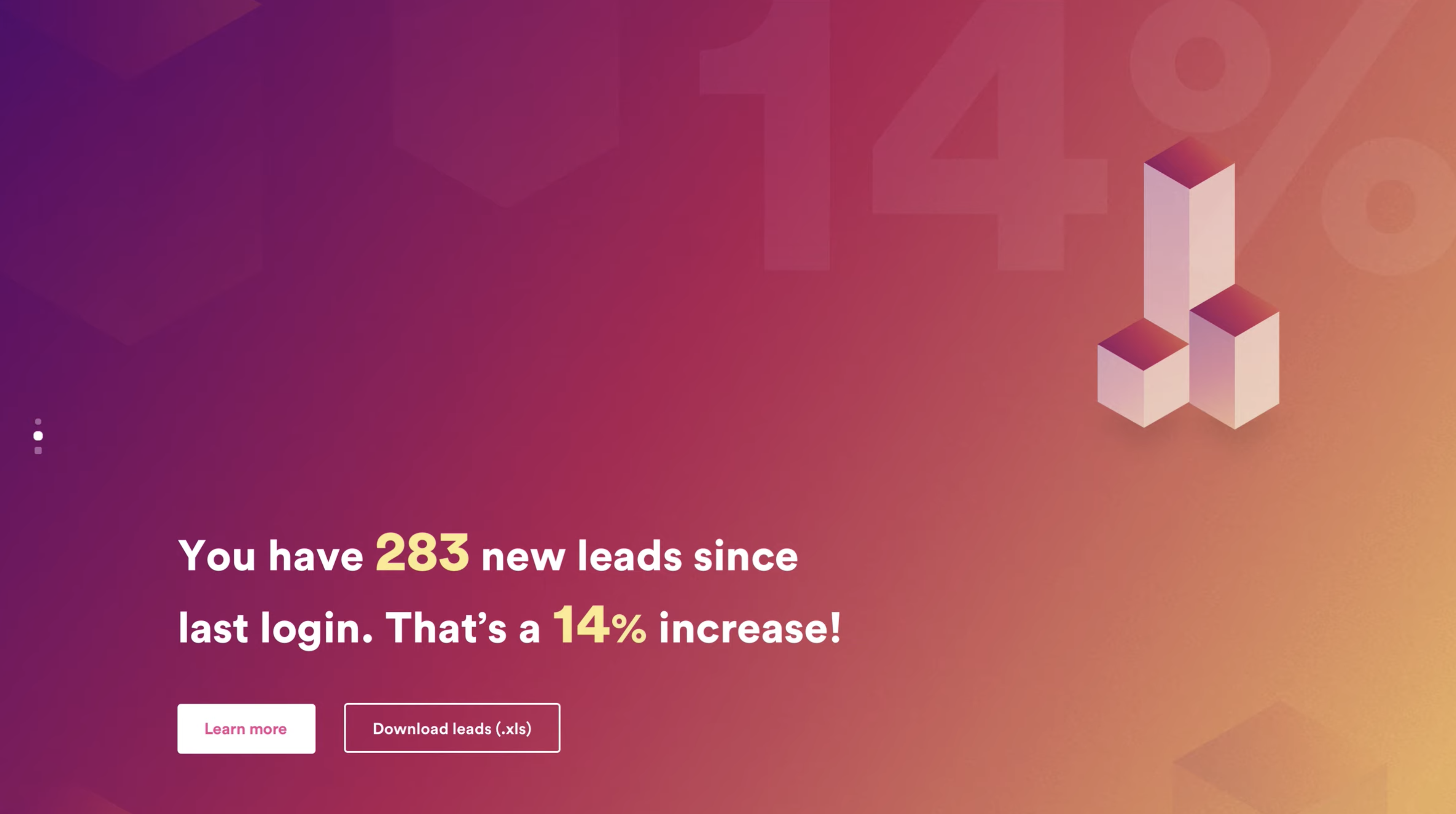
Upon login, users are greeted with things they should be aware of - a conversion rate increase, or a drop of visitors compared to last period. Quick actions can then take them to corresponding areas to dig deeper.
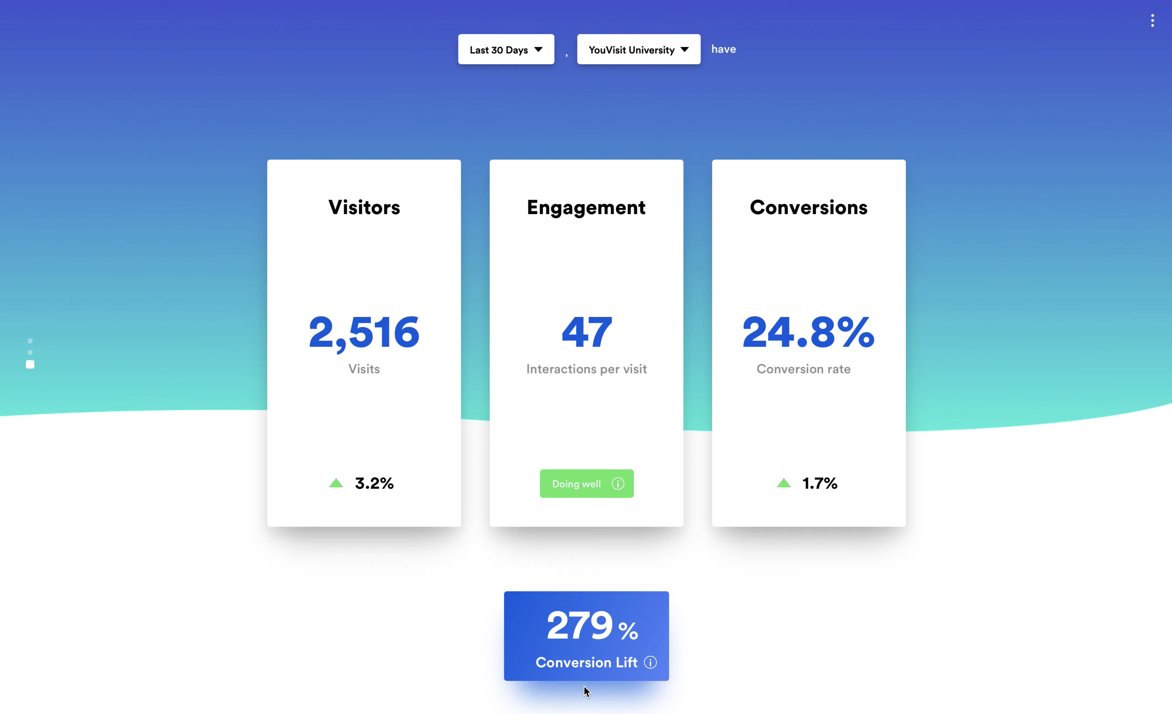
The main page highlights just 4 key metrics to virtual tour's performance. The card design brings a playful and friendly feeling, serving as the way users navigate to further details.
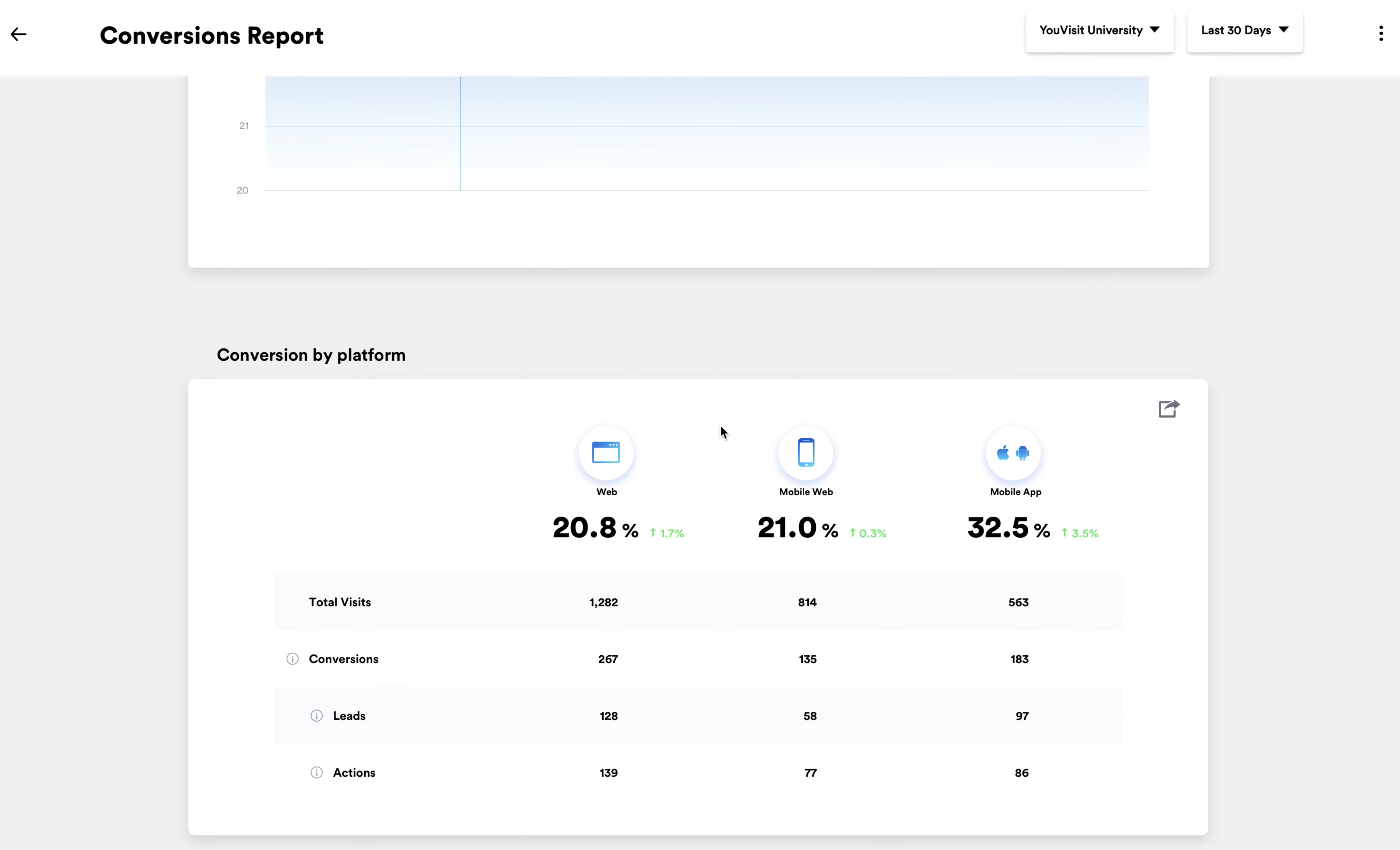
Charts and tables in the detail pages have generous spacing and distinguished visual hierarchy to make the data digestible and presentable when our clients showcase our impact to their stakeholders.
Results
+20%
Montly Active User
+3%
Client Retention Rate

