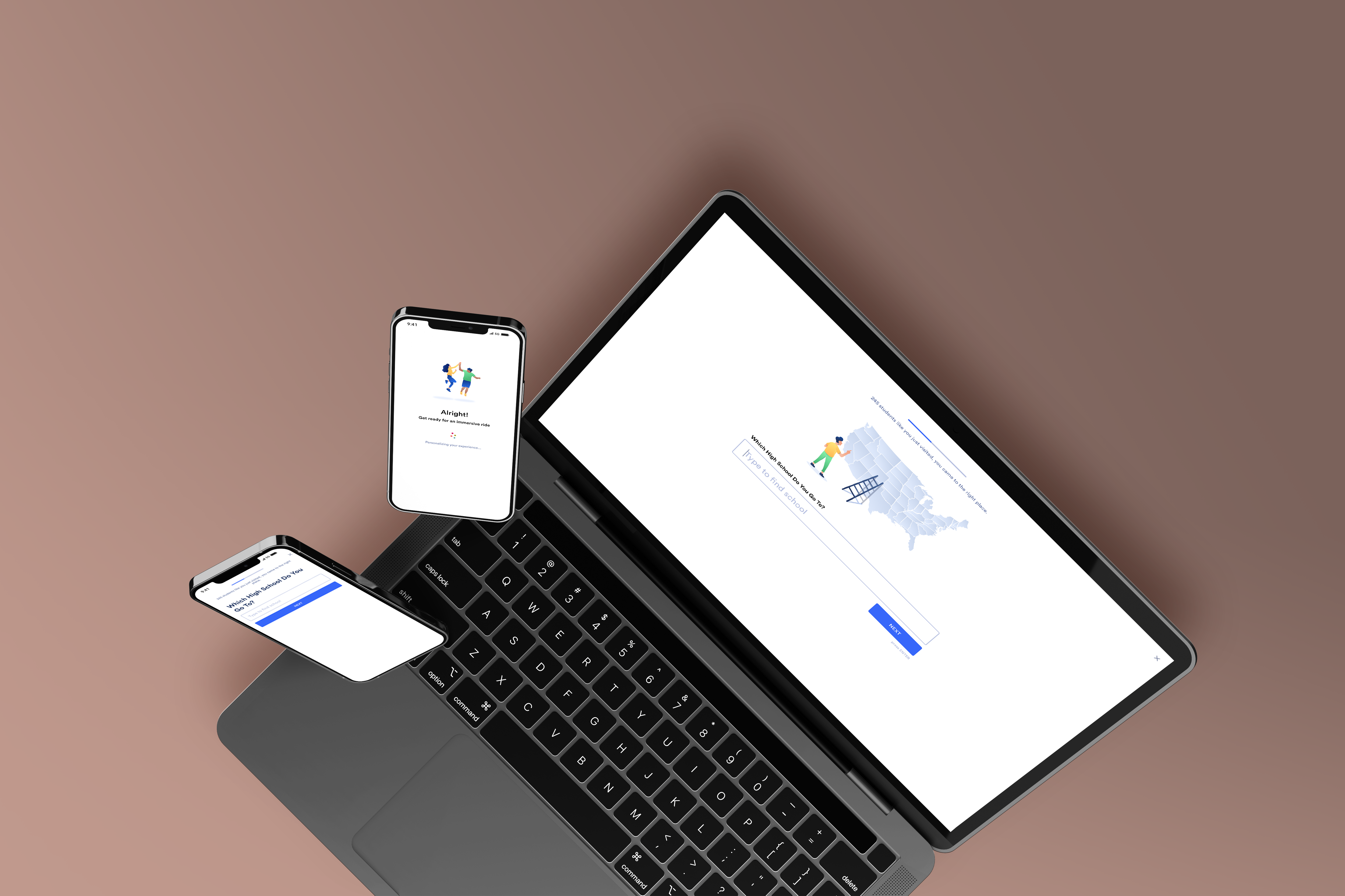
Redesigned YouVisit's lead generation form and doubled the conversion rate to ~38%
Background
Lead generation is the key value we deliver to our clients - connecting them with leads interested in their service after visiting our virtual tour, whether it's a university, restaurant, or cruise trips.
The original form was getting already good conversion rates of 18% compared to industry average. Nevertheless, we challenged ourselves to make it 25% so our solution is almost a no-brainer for our clients in terms of ROI.

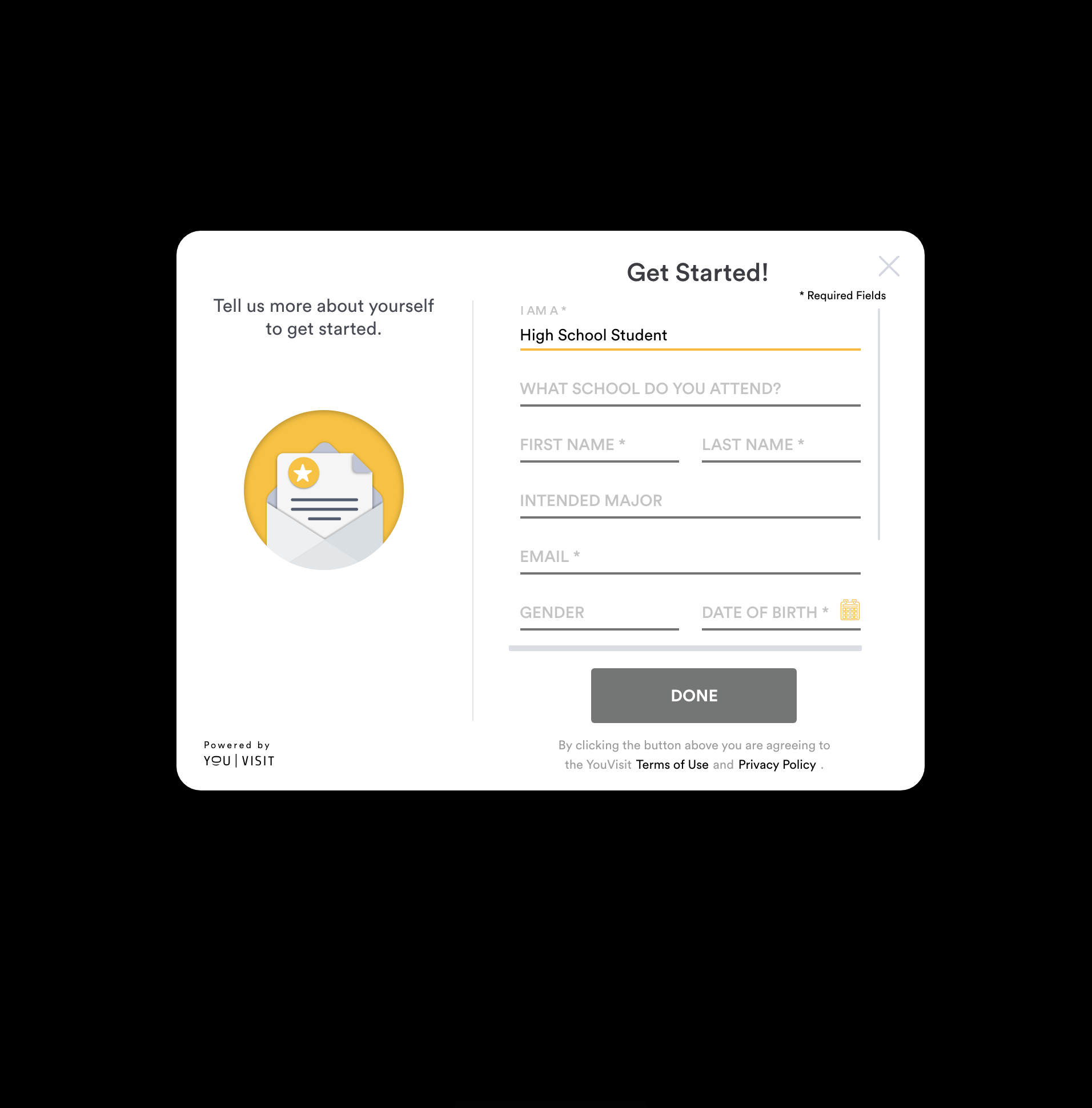
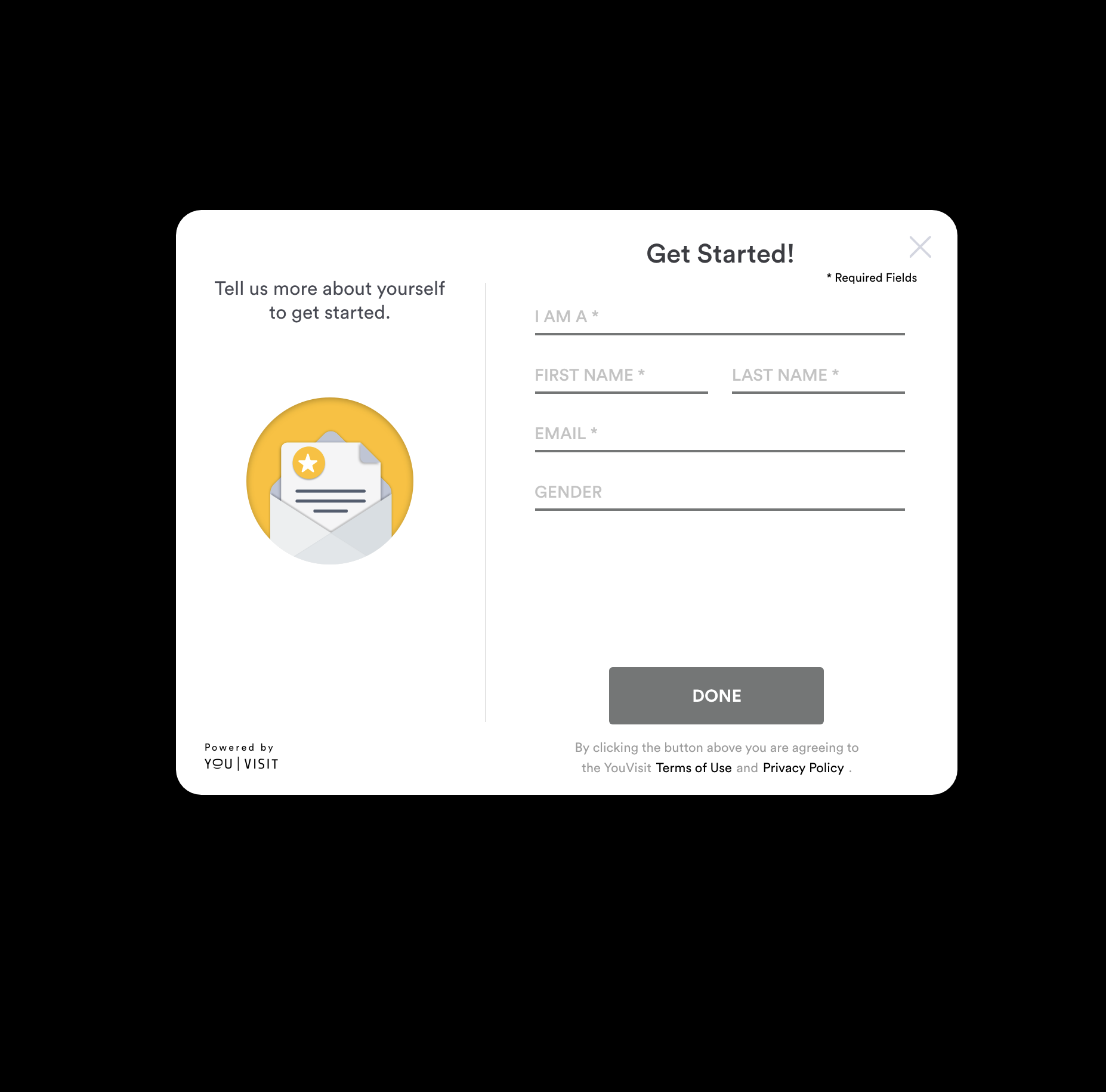
Original inquiry form before the redesign
There are a few problems with the original form
After the visitor type is selected (first field), the form gets a lot longer, which can discourage users from proceeding.
A Long form where all fields are exposed on one page is hard to navigate and complete on Mobile.
If the user drops off, no data is captured even when most fields are filled in. While often times an email is enough for the client to follow up.
Our Approach
The competitive analysis on other forms and survey tools suggested a promising conversion rate lift when questions are broken down into steps, rather than exposed at once.
We wanted to leverage that approach to make the form less overwhelming or boring, but more like a conversation.
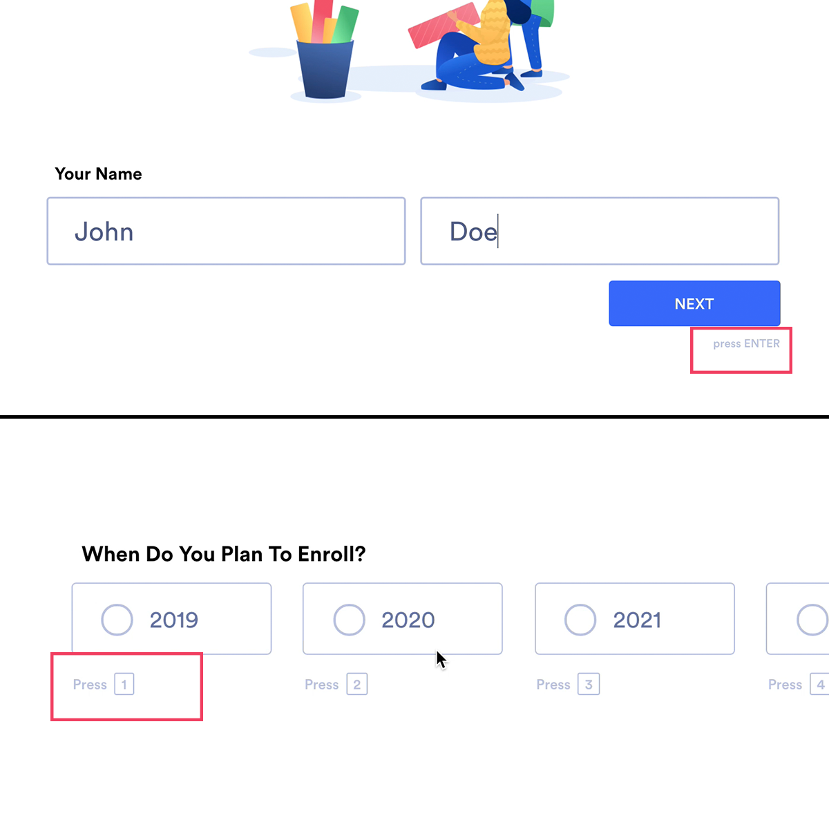
Getting keyboard support right is also important so that the user doesn't have to frequently switch between mouse and keyboard.

Further more, we wanted to gamify the flow so the user is encouraged to proceed.
We shy away from indicating the number of steps, which could scare some users away. Instead, fireworks go off when proceeding to the next question as a way to visually reward the user.
Users tend to close a form because it feels like it's just collecting data. To flip that, we had the idea to provide relevant facts according to their answer, so they actually benefit from proceeding further.

Results
2X
Conversion Rate Lift
38%
Conversion Rate with New Form
The final Design (recorded from an HTML prototype I built)

